Monday, 18 April 2011

Example of interesting functions & purposes - BRANDING & LOGO DESIGN


I saw this logo on an old brief we were given this week. It was DLKW's logo before they merged with LOWE & Partners. 
I thought it was brilliant. One of the more clever logo's I have seen. And it is so incredibly simple. 
I am just thinking about a designer, sitting there, just playing around with the type and thinking "WOW". 
The different colours give it a playful feel, the sans serif type both makes the design and also makes the company look approachable. 
The clever face adds to that feel, with the wink made out of the 'K'.
A clever logo makes people think that you have the right kind of brain to create clever adverts. Lateral thinking is everything. 
This comes in the time when I am trying to come up with my own logo. Really making me think. 

Example of interesting functions & purposes - BOOK COVER DESIGN


I have always been interested in designing book covers. Essentially a personal interpretation of a piece of writing. These are some of my favourite books, and what initially drew me to the series was the covers, especially the hardback editions. I cannot think of anything more exciting than the release of a new one of these, sitting in my hands, wonderfully heavy, gold embossed typography over a simple photograph... allowing the reader to make their own assumptions of the book before even starting it. 
I immediately know what the main theme of the book will be just by one subtle hint on the cover. 

You can tell the novel is going to be full of sex and glamour from the content of the photograph, the shots against a white background add to the simplicity and class of the cover, as does the clear, serifed type for the title, and shining, foil covered sans-serif for her name. 

Example of interesting audience & content


This is a WWIII propaganda poster in a series. The style has been taken from a WWII poster, even the imagery, but has totally changed the context by adding slight changes to the content. Absolutely brilliant piece of design. Very well thought-out and tackles an ongoing debate about Google Earth and it's use in terrorism and war placement. 

Sunday, 17 April 2011

Knitted Typography

This is a Swedish typeface based on knitting. 
Much more what I had in mind... really getting my mind going with the possibilities for the type aspect of this book. 


Knitted & Embroidered typography

These are more examples of thread-generated type. 

The embroidering adds patterns which you could not achieve with knitting. 


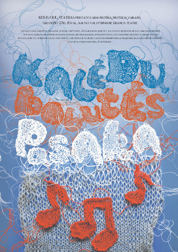
Knitted typography

This is some type generated by knitting. 
It was all hand-made then produced in photoshop. 


Used in a poster...

This is very interesting... I could use this for my book. Or ideas and aspects of it.

Thursday, 14 April 2011

Example of interesting media & process - LETTERPRESS


Since the induction last year at Vernon Street, I have wanted to use letterpress in my practise. I don't really know why I haven't until now but it is definitely something I am going to incorporate in some way in the next part of the course.
This is an interesting way of using it. In the induction we very much used it in lines and compressed together. I like the way they have used it in a circle and created layers of type with it. I would be very interested to see how they did it. Placing the letters in the press etc...