Now this wouldn't be a project of mine if this blog didn't include Anberlin somewhere now would it?
This first example is my favourite. It was completely created using After Effects and Photoshop. It is a mix of type, image and video, incredibly cleverly put together.
This is a very 2dimensional reproduction of 'Breaking'. Not to the standard of the last one, but it is all in time. If it were up to me I would have chosen different typefaces, different colours and less tacky-looking imagery.
Similarly with this one...
Tuesday, 21 December 2010
Kinetic Typography - Wall Street Riots - Dr King
This has a much broader use of colour and different typefaces throughout the video than some of the others I have put up.
Kinetic Typography - Fear and Loathing...
This is a really imaginative use of type and image. However simple it is, I feel it gives a real insight into the theme of the book/film. The way the type starts to degenerate as the story goes on, the higher and more erratic they get.
Kinetic Typography - The Social Network
This video shows a really good range of different typographic methods to add emphasis on certain words.
The creator has considered the type (the facebook typeface), the colour (the facebook logo and website colour) and really listened to the words making them larger and smaller where needed, more condensed, spread out and different orientations. Brilliant.
The creator has considered the type (the facebook typeface), the colour (the facebook logo and website colour) and really listened to the words making them larger and smaller where needed, more condensed, spread out and different orientations. Brilliant.
Kinetic Typography - V for Vendetta
This is the scene in the film where V introduces himself using a string of alliterations.
Incredibly clever idea because of the depth of how much you could do using typography.
Incredibly clever idea because of the depth of how much you could do using typography.
Kinetic Typography - Stephen Fry - Language
This is different to the other examples of kinetic typography that I have shown on this blog as it does not go along with music.
This person has spent a lot of time getting the exact words and timings right to really add depth to this Stephen Fry essay on language and add whole new meanings to it.
This person has spent a lot of time getting the exact words and timings right to really add depth to this Stephen Fry essay on language and add whole new meanings to it.
Kerrang! ident.
This is another Kerrang! ident. One that is all over the channel today. This one is only 8 seconds long.
Blasted!
Blasted!
Kerrang idents.
This series of idents for the Kerrang! music channel won a Design Week Award for 'Best TV/Film/Video Graphics' beating strong competitors such as SKY1 and BBC3.
They use recurring characters which make them a set and really cleverly encompass the whole feel of the rock music channel.
This kind of thing gets me excited, not only because this is my favourite kind of music, but because of the possibilities for this project, really looking into things I love and are particularly interested in.
BBC - montage of BBC1 idents
I remember when these first came out. Ingenious. They keep you watching until the end... and keep you watching the channel to see what they come up with next.
I particularly love the christmas ones, especially this one with the elves. It really gets you into the spirit.
I particularly love the christmas ones, especially this one with the elves. It really gets you into the spirit.
Tuesday, 7 December 2010
Smart Car - Against Dumb
This is a brilliant use of after effects.
Smart Car - Against Dumb from Buck on Vimeo.
Director: Buck
Creative Director: Orion Tait
Executive Producer: Anne Skopas
Producer: Kitty Dillard
Design: Gareth O'Brien / Yker Moreno
Lead Animation: Gareth O'Brien
Additional Animation: Chad Colby / Harry Teitelman / Yker Moreno / Claudio Salas /Jacques Khouri
Sound Design & Music: Antfood
VO Talent: Tirtzah Wilson
Agency: Strawberry Frog
Thursday, 2 December 2010
Kinetic Typography - Blink 182
I know Fred showed us this in a seminar, but I watched it again, and, timing and effect wise, I think that this is one of the best pieces of kinetic typography to a song that I have seen yet.
Every word is exactly in time, and a lot of thought has gone into the effects.
I especially like the small video clips of the band members and the way they interact with the type.
Brilliant.
Kinetic Typography - Muller rice advert
This is very literal, but brilliant. Every time I see it I think "how could I put that into context for a brief?"... and here it is.
Tuesday, 30 November 2010
DVNO - Justice - Music Video
I think I have already put this video on to this blog at the beginning of the first year, but this is the perfect time to put it up at the beginning of this module.
It is a video that uses type and moving image throughout.
It is a video that uses type and moving image throughout.
Casino Royale - Opening credits
From the time this came in the cinema this opening scene has stuck in my head.
The use of type and imagery is inspirational. Putting into context the casino theme using the imagery from a deck of cards, adding guns and blood to really put the James Bond films theme in.
The use of type and imagery is inspirational. Putting into context the casino theme using the imagery from a deck of cards, adding guns and blood to really put the James Bond films theme in.
Silent Movie - 3 Words
SNAP - centre of the frame
EXTEND - spacial movement within the frame
ZOOM - a lot more space for movement within the frame
Monday, 22 November 2010
Paper to print... posters for the underground
I have been using the CBS Outdoor Advertising site to do a lot of research into how to go about printing posters to produce successful advertising campaigns on the underground.
Looking up previous campaigns and trying to associate them with my own.
For the escalator panels... you can only print 100 or more posters. And the following companies print both litho or screen onto approved fire retardant board.
For the 4 Sheets, there is a list of different places who will print your posters for you to the correct specifications. Again using litho print.
AUGUSTUS MARTIN LTD.
St. Andrew’s Way
Bromley-by-Bow
London
E3 3PB
Contact details:
Laurie Haldane or Simon Crabb
Tel: 020 7536 5222
Fax: 020 7537 2182
Email: tubecard@amartin.co.uk
ISDN: 020 7537 9971
DELTA DISPLAY LTD.
153-157 Blackhorse Lane
Walthamstow
London
E17 5QZ
Contact details:
Bill Moore
Tel: 020 8498 4400
Fax: 020 8498 4401
Email: cbs@delta-display.com
ISDN: 020 8531 6450
SMP GROUP
2 Swan Road
Woolwich
London
SE18 STT
Contact details:
Claire Mitchell or Nigel Mogg
Tel: 020 8855 5535
Fax: 020 8855 5367
Email: cbs@smpgroup.co.uk
ISDN: 020 8317 2194
For 6 Sheets, the CBS print them themselves, all you need to do is send a PDF of your specific file to the following address, and they go from there. They also use litho or screen print processes.
CBS Outdoor -
Copy Approval
Camden Wharf
28 Jamestown Road
Camden
London
NW1 7BY
For the 4 Sheets, there is a list of different places who will print your posters for you to the correct specifications. Again using litho print.

All of these posters were printed on Blueback poster paper. It is now transitioning into CBS Outdoor Performance paper, designed by the CBS for more money-efficient printing.
All of the size specifications and prices for these 3 separate poster scales are previously researched in this context blog.
If I were to print myself, I would use litho print, however this would be impossible for the task at hand as you would need to print in bulk (100 or more) so I am just going to print on the nearest stock available to this as a mock-up for this module.
Putting my posters into context... The London Underground.
I have chosen a range of 4 Sheets, 6 Sheets and escalator panels as previously researched.
Escalator panels


4 Sheets

Backlit 6 Sheet

6 Sheet

I want to work out how to successfully use photoshop to really show what I am trying to portray... including using backlighting effects.
Stair, Corridor, Lift and Escalator advertising on the London Underground...
After looking at pricing, printing and all the specifications, I've realised this is the most economical way of advertising on the tube.
It is also the most repetitive... when you are bored on the escalator, they are the only thing you see. Repeated endlessly.
These are a few examples...


It is also the most repetitive... when you are bored on the escalator, they are the only thing you see. Repeated endlessly.
These are a few examples...


Sunday, 21 November 2010


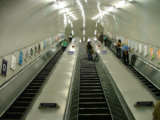
Stair, corridor, lift and escalator pannelling
The most effective way of advertising on the underground... the repetition really gets the picture across.


4 sheets paper


This really helps with my research and my print processes... it tells me exactly what paper I would use if I were to print these up.


London Underground advertising... 6 sheets
After looking into the different places to advertise on the underground... I have chosen specific formats of poster that I want to use.
Firstly... 6 Sheets.


Firstly... 6 Sheets.


Underground advertisement. Context.
This is an image I found whilst looking at another blog of mine. It seems to put my project right into context. It shows that most of the adverts on the underground are depicting things which would be expensive... and for people using public transport, this seems reasonably ironic.
I liked this image as it was unusual, and seemed to fit perfectly.
I am not trying to sell anything... in fact what I am promoting is totally free. Comes from within...

I liked this image as it was unusual, and seemed to fit perfectly.
I am not trying to sell anything... in fact what I am promoting is totally free. Comes from within...

Putting the posters into context...
Following a seminar we had with Fred, I decided to try and illustrate as simply as I possibly can how my posters will appear in real life... in a tube station. I want to show this both photographically, using photoshop to super-impose my images onto existing advertising campaigns, and using illustrator to simplify the image to really put it into context...
This is where I am at so far...


I chose these two images straight off because I want to put them into different parts of the tube stations and these two seemed a good place to start...
Look at my design practice blog to see the illustrator versions of these images...
Saturday, 20 November 2010
Further logo research...
Whilst on my quest to design a logo, I expressed my difficulties to a friend of mine and he showed me a brilliant logo website.
These are a few that have really inspired me.


These are a few that have really inspired me.


Friday, 19 November 2010
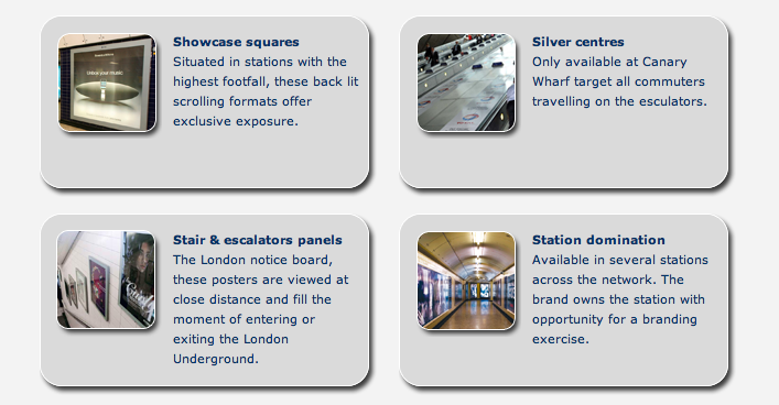
Tube Advertisement
I have been looking into the different places and sizes that are standard to advertising on the underground in London. Also how you would actually go about getting your adverts down there.
www.transportmedia.co.uk has helped a lot with this research.
These are the different formats of posters/moving image adverts which are available on the tube...


www.transportmedia.co.uk has helped a lot with this research.
These are the different formats of posters/moving image adverts which are available on the tube...


Subscribe to:
Posts (Atom)