Thursday 28 April 2011

Amazing

I thought this was brilliant. So thought I would put it up here. 

Tuesday 19 April 2011

Gig Posters - Mates of State

Designer - The Small Stakes


Again, a beautiful poster. Like the previous ones... it is very much made to look nice, to catch the eye, and to be informative about the gig itself. 
The clever heart made up of finger prints is the first thing you look at... followed by the headline band. 
Simple colours, simple design. A collectible. 

Gig Posters - Islands

Designer - Show & Smell Print

This is one of my favourite posters from the series that I have recorded on this blog.
The colours and hand-rendered feel make it look very friendly. It has a distinctive style. 
As I have stated previously... I would like my work to have a more hand-rendered feel to it, and this is an example of what I mean. 

Gig Posters - Flight of the Conchords

Designer - Tyler Stout


There is so much detail in this poster that it makes you look more at what it could be. Each little illustration relevant... or relevant to fans of Flight of the Conchords. Making this very-much audience based. 
They have only used 3 colours, but even with this, the background is a big mess of detail. Bringing the characters and the type out, drawing the eye.
The rest of the information about the gig has to be deciphered from the background with hand-drawn type blending in to the illustrations. 
This is really clever as it makes people look at the poster for longer to draw out the information. 

Gig Posters - Deerhoof

Designer - The Small Stakes

Primarily, I loved a lot of these designs for the way they look. Gig posters are so distinctive, and, if done right, both look beautiful and portray exactly the message they are trying to convey... basically informing people of the gig... where, who and when. 
This design is so simple, but perfect. The use of the CMYK bubbles creating a flower, with the simple vectorised arm becoming the logo. 
The yellow on black stands out and gives a sense of urgency... drawing the eye towards the name of the band. 
The information about the actual show is right in the middle of the 'petals' - again in yellow on 

Gig Posters - The Decemberists

Designer - Little Jackets


This has a very 'kitsch' feel. Very simple, one colour plus stock, playing with the opacities to make it appear that there is more. 
No detail in the illustration, just vector silhouettes... and repetitive patterns in the background. 
If you have ever heard of these bands, or heard their work, this poster accompanies it very well. Getting the tone of voice of the music in graphic design. 

Gig Posters - Cat Power

Designer - The Heads of State


Again, this is very simple. Two colours plus stock. It looks like the type has been screen printed over the top of the wallpaper-esque pattern in the background. 
This is more image based... the focus on the little girl and the distorted type around her. 

Gig Posters - Calexico

Designer - The Small Stakes


Now this is a brilliant piece of typography. Stunning, in fact.
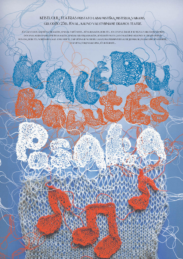
The important text (the name of the band) stands out. This will attract the audience's eye. It is decorative type, but both readable and legible and beautifully intricate. 
I am seeing this with a lot of gig posters... they really do both grab the eye, and seem to be created to 'look pretty'... aesthetically pleasing you may say. Making them collectible. Things that people will take from the walls - or even buy, to keep forever and put up in their own houses... adding a new function to the poster... this will then remind them of the band whenever they see it. 
There is a clear higherarchy of type... the most important being the name of the band... and then the name of the support and the place and time in green... again, raising that out of the page by using colour. 
What a lovely piece of work.

Gig Posters - Broken Social Scene


Designer - The Small Stakes

Gig Posters - Beck

Designer - The Heads of State


This is very unlike the other posters which I have put on this blog. The type in the boxes just B-E-C-K repeated throughout the image, although this is not clear... making the person looking at it... look at it longer because they want to make out what it means. 
The type at the bottom of the poster is again, very minimalist and shows just the information needed. It is very much concept-driven, rather than being clear. 

Gig Posters - The Arcade Fire


Designer - Mike Weish

This is very much image based... overcoming the whole poster with clever illustrative type being made out of the branches. It looks very much hand drawn and you can see the process in which it has been layered up clearly. 
The informative type is simple and clear and very minimalist when it comes to the information. Simply stating the details of the show that it needs to get across.
This is one in a series which is collectible for fans - very much audience driven, for people who will pay money to remember the date.

Monday 18 April 2011

Example of interesting audience & content - PELICAN/METAL MUSIC FANS/ENTHUSIASTS


This is a beautiful piece of print created by The Delicious Design League for the band Pelican. 
I admire this intently, both because of the way it looks and the message it shows. It shows Pelican to be a band that care about their image. That people who pay for their album get something worth-while.  A lot of work has gone into this design, a brilliant mix of photography, patterns and texture, and carefully thought-out type. 
This is very much aimed at Pelican's fans, and fans of metal music. It is a very limited edition poster, aimed at the fans loyal enough to spend the money on it.

Example of interesting audience & content- AMERICANS


This is one of a series of prints with the theme 'influential tweets' by Mike Kus. 
This one is particularly political and patriotic. This is shown with the American flag flying high, the positioning as high as the moon. Very much aimed at Americans, but also made to look pretty. I put this in my PPD blog as well as it is a style that I would very much like to work in, the hand-made looking feel... although this is completely computer generated.

Example of interesting functions & purposes - BRANDING & LOGO DESIGN


I saw this logo on an old brief we were given this week. It was DLKW's logo before they merged with LOWE & Partners. 
I thought it was brilliant. One of the more clever logo's I have seen. And it is so incredibly simple. 
I am just thinking about a designer, sitting there, just playing around with the type and thinking "WOW". 
The different colours give it a playful feel, the sans serif type both makes the design and also makes the company look approachable. 
The clever face adds to that feel, with the wink made out of the 'K'.
A clever logo makes people think that you have the right kind of brain to create clever adverts. Lateral thinking is everything. 
This comes in the time when I am trying to come up with my own logo. Really making me think. 

Example of interesting functions & purposes - BOOK COVER DESIGN


I have always been interested in designing book covers. Essentially a personal interpretation of a piece of writing. These are some of my favourite books, and what initially drew me to the series was the covers, especially the hardback editions. I cannot think of anything more exciting than the release of a new one of these, sitting in my hands, wonderfully heavy, gold embossed typography over a simple photograph... allowing the reader to make their own assumptions of the book before even starting it. 
I immediately know what the main theme of the book will be just by one subtle hint on the cover. 

You can tell the novel is going to be full of sex and glamour from the content of the photograph, the shots against a white background add to the simplicity and class of the cover, as does the clear, serifed type for the title, and shining, foil covered sans-serif for her name. 

Example of interesting audience & content


This is a WWIII propaganda poster in a series. The style has been taken from a WWII poster, even the imagery, but has totally changed the context by adding slight changes to the content. Absolutely brilliant piece of design. Very well thought-out and tackles an ongoing debate about Google Earth and it's use in terrorism and war placement. 

Sunday 17 April 2011

Knitted Typography

This is a Swedish typeface based on knitting. 
Much more what I had in mind... really getting my mind going with the possibilities for the type aspect of this book. 


Knitted & Embroidered typography

These are more examples of thread-generated type. 

The embroidering adds patterns which you could not achieve with knitting. 


Knitted typography

This is some type generated by knitting. 
It was all hand-made then produced in photoshop. 


Used in a poster...

This is very interesting... I could use this for my book. Or ideas and aspects of it.

Thursday 14 April 2011

Example of interesting media & process - LETTERPRESS


Since the induction last year at Vernon Street, I have wanted to use letterpress in my practise. I don't really know why I haven't until now but it is definitely something I am going to incorporate in some way in the next part of the course.
This is an interesting way of using it. In the induction we very much used it in lines and compressed together. I like the way they have used it in a circle and created layers of type with it. I would be very interested to see how they did it. Placing the letters in the press etc...

Example of interesting media & process - Pierrick Jegou - Photography & Type


This is a piece I also put on my PPD blog. I love this frenchman's work, but this piece especially stands out to me.
I have always been interested in photography and this is an effective way of making it speak for itself... adding type to communicate a message.
The thin type compliments the photograph perfectly.
This image really strikes me, I think there is that slight "I like it because it looks nice" effect. But that is in no way a bad thing.

Example of interesting media & process - Seb Lester - HAND-RENDERED TYPE


This is an absolutely stunning piece of hand-rendered type by Seb Lester called 'Dreams'.
"The five lettering styles I developed are, as always, drawn from scratch. I was inspired by some of the finest lettering in history but aimed to produce work that looks contemporary, stylish and relevant today."


Example of interesting media & process - Luke Ramsay - HAND DRAWN ILLUSTRATION


This is some of the incredibly intricate illustrative work by artist Luke Ramsay.
It is clear that the process and media drives this work., he has drawn the images with ink onto paper, adding the colour digitally.
This is a process which really interests me. Looking into different ways of adding colour to line drawings. The pros and cons of adding it digitally.
I really like this work, the colours are soft and the theme is surreal.
He adds harmony into organised chaos.

Example of interesting media and process - 'Leggy Stunnerz' - Jock Mooney & Alasdair Brotherston - SCREEN PRINT


This is a collaboration between a contemporary artist and a film-maker.
This book was painstakingly screen-printed in 50 limited edition copies on 280g BFK Rives tan coloured paper. At full-length, the concertina book stretches to 1.4m.
All the characters in the book have been given extra legs, playfully depicting voodoo idols and orthodox Christian icons thrown together with pop moptifs.
This is an example of intricate, well thought-out screen printing. The belly band is embossed. Two processes which I am very interested in developing my skills in further.

Example of interesting media & process - Nazario Graziano - COLLAGE


I really admire this work mainly for it's use of mixed media.
A lot of thought has obviously gone into the design process and the results are very pleasing to the eye... for me anyway. This is definitely a way of working that I want to start incorporating into my own designs.
It looks very hand-made, although I am sure it is not. An intricate collage of photographs, line drawings and shapes with textured backgrounds. I would be very interested in producing work like this, looking into the different textures and content to create something very intricate and personal.