Wednesday 16 November 2011

Supremebeing - logos

At first I was thinking of re-designing the logo, which, I still might do. 
They have a range of different logos, both in upper and lower case letters which I thought was interesting. 


I think that I am going to adapt this logo for the Alpine Soundtrack, maybe adding a very simple vectorised snowboarder. 

Supremebeing - Previous Tshirt designs

These are a few of the designs that I have been looking into on the Supremebeing website. There are a whole range of different approaches to these, illustration, collage, photography to name but a few. I think that my style will work very well with this kind of design. 


Wednesday 9 November 2011

O2 Academy Leeds listings

This is the line up that I would most like to work with. There is a huge range of gigs and it is bigger than the other ones that I have looked at. It may also be more appropriate as it is in Leeds, it will allow me to go down and find out extra information about the gigs that would need to go on the posters. 


This range also includes a lot of my favourite acts who I would love to create posters for. I am quite a subject driven designer, so this could be a good opportunity to work with. 

Concorde 2 - Brighton - Listings

This is another venue that I am interested in creating the posters for. The club has a lot of imagery attached to it because of it's location right at the bottom of grande parade on brighton beach. 
I could really give this a new identity at the same time as creating the posters, add another level to my brief. 


This venue has a lot of range in the gigs that they put on genre-wise. I could really push my creativity with this one.

Kentish Town Forum listings

These are the listings that I could choose from if I were to chose the Kentish Town Forum venue in London for my gig posters brief.


I don't know whether there is enough of a range of different music genres in the line up to be able to really push the idea of a series, but different genres.

French collage poster

This is one of my favourite pieces of design that I have come across so far.
The combination of images, the different balloon shapes and the array of figures, walking around the centre are strangely appropriate. The balloons at the top of the poster and the plants at the bottom. 

The type also goes brilliantly. This is a super piece of design.

Collage

Another example of a collage style that I will draw inspiration from. Like a few of the others, it has very neutral, earth colours, nothing bright. I also like the different textures and images they have put together.


Abstract Pattern

This is an example of a background/abstract pattern that I would like to include in some of my designs. The colours and triangle shapes correlate well. 

Tuesday 8 November 2011

Mixed media - Wonder, Wander

This is another example of mixed media that I would like to draw inspiration from. 
The mixture of type and and image is executed perfectly, along with the mix of diamonds, both photographs and line drawings in the background. 
The designer has extracted a lot of different assets drawn from diamonds as inspiration and put them together to make a very appropriate piece.

Collage and texture work

These are another example of something that I wish that I had done. 
The subtle layers and colours add a very haunting feel to the images, a whole load of different textures and images that add depth and age. 
Stunning. 


Mixed Media Collage - Nikki Farquharson

This is a series of collages by London designer and illustrator Nikki Farquharson. 
They show a big contrast to the work previously exhibited on this blog.
They are very loud and vibrant, full of content. 
What I admire about them is the fact that, with all the abstract coloured patterns and shapes in the background, the eye is still drawn to the centre where the model is placed. 


Sebastian Ospina - Mixed Media

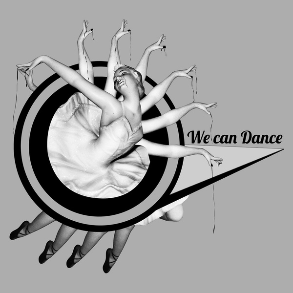
This is a series of collages by Columbian Graphic Designer Sebastian Ospina. 
I found these a great inspiration and had a "I wish I had done these" moment when I saw them. 
The neutral tones of the background bring out the images and give a much more vivid feel to any colours that have been put on top. 
I also admire the amount of detail put in. Collage can get over-complicated very easily, and I do not see that exhibited in any of these.
The combination of hand-drawn assets, photographs and abstract shapes is perfect in my eyes. I would add type in with it, as is shown in a couple of these. 
I am going to try and use techniques that I have been inspired by in these pieces for a number of my briefs, namely the gig posters and the supremebeing ones.