Thursday 26 May 2011

Tshirt tags

These are a few t-shirt tags and attachments that I drew information from for my t-shirt tags. I wanted to make the t-shirts more special by adding little touches. 


Examples of graphic design websites

These are a few Graphic Design websites, both companies and freelancers that I drew inspiration from for my own website for Love 4 Design.


They all have their similarities... the same kind of buttons and links and pages.
I have taken information from these to design my own. Especially the bottom one for 'Daniele Volpin' - his website is clean and clear... simple but stylish. This is exactly how I wanted mine to look.

Tuesday 24 May 2011

Merch table images

These are some photographs of merchandise stalls at shows/gigs. 
These are exactly where I intend my range to be sold/distributed. 


The singles and music sold on the table... posters and Tshirts exhibited up on a board. 
I intend to photoshop my images into these... maybe make up a vectorised merch stand. 

Thursday 19 May 2011

CD, 7" and 12" cases

For some primary research I went down to a record store and looked at the different sleeves and packaging for all 3 formats. 
I bought the 3 that I liked the most so that I can take them apart and use the nets for my own designs. 

It has also helped me see the content that I need to include on mine... barcodes, content etc...

CD packaging.

This one was interesting but I feel that there is too many pages full of useless content. I do not like the plastic CD holder either.


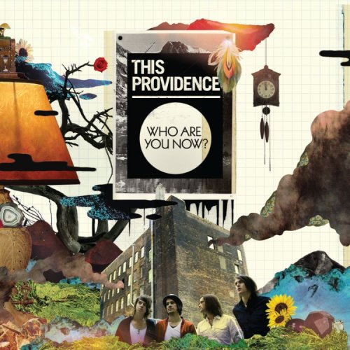
 This was the one I bought and the net I am going to use. I like the slot that has been cut into the actual design to make space for the disk. There is also room for playing with layers on the different plains of the packaging.


7"packaging
This was the most interesting. It needs no sticking down and the actual packaging itself really works to get it's point across. 


This one has been screen printed, which I won't have time to do. But it has come out beautifully. 

12" packaging. 
I did not want to just have a sleeve for this one so picked a design which I could play around with different designs on the separate pages. 


Now to get on with drawing the nets and then reproducing them in illustrator. 


Standard CD cover - design information


These are the sizes for a typical CD case.
As I am doing an EP, which are usually in paper/card cases... this is going to be different. 


Ingenious drama festival poster design

Calistoga 'Still Normal' album cover

Amplitunes Innards cover


Frost your next cake free


East of Eden

Acolytes poster

Calendar design


This is a calendar design which has focused a lot on the more hand-rendered end of collage.
There is a lot of line-drawing combined with hand-drawn type and different layered textures which have been carefully selected to add rather than retract from the image. 
The use of colour is very focused with a restricted palette which, in itself, is very bright, contrasting with the neutral colours which make up the back-ground. 

Un-Touchable flyer design


This is a flyer design for an event for young teenagers. It has been designed to be very much audience-led. The designer wants to get the retro feel of the event by using collage and 'retro' imagery.... also drawing in the younger audience by using bright colours and interesting imagery. 

Elan Snowboards website


This is another example of a website that have used collage as the main theme. 
Like my project, it has chosen certain aspects of one fixed collage, and have animated and changed it throughout... which is the main idea with my website, separating it out into different components to illustrate different aspects of the website. 


Nokia 5300 website design - Jeff Mendoza


This is a design for a website which has incorporated some of the ideas that I am using for my project. It is a mixed media collage which is used for screen. As the pages of the website progress, different aspects of the collage are animated and changed. This is what I am going to propose for the website pages that I am going to produce. 
For the design he focused on urban, construction, graffiti and pop-art to make it look contemporary whilst at the same time keeping it simple to use and direct around. 

Tuesday 17 May 2011


This is a highly poignant image which uses several different layers of imagery to make up the dark background. There are some layers which, through layering you can hardly see, but the detail from them adds to the final image. The type is what stands out, very much the focus of the piece.
It has dark, sinister connotations, made more so by the dark and black and red, insinuating blood and decay.

Audrey - tears of frustration


This is similar to some previous examples I have put on this blog. It shows how colour imposed through collage onto a simple black and white photograph can translate emotion. In this case... it has been super-imposed on to the eyes, blocking them out and creating tears.
The tears are spiked and vividly coloured... insinuating anger and frustration. 

This Providence - Who are you now?


I came across this album cover the other day by chance, was listening to the album and subsequently noticed that the style of the album art was exactly the kind of design that I wanted my work to take inspiration from.
The simple background goes very well with the complexity of both the detail and the colours of the rest of the images.
I like the way that the images, seemingly un-related fit together so well, with carefully blended edges and colours.
There are a large amount of seemingly hidden in this intricate design. This is exactly what I am trying to do with my work.

'Let's cheers to this'


This is an interesting use of collage. Very simple and very 'to the point', a clear juxtaposition of images drawn from photographs and textures.
The type in the banner is a standard serif font which does not take away any focus on the image.
The neutral colour palette adds to the subtlety of the image, making it look natural and warm. My first thought when I saw this was bland, desert heat.