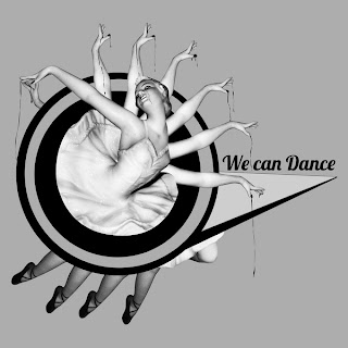
This is a series of collages by Columbian Graphic Designer Sebastian Ospina.
I found these a great inspiration and had a "I wish I had done these" moment when I saw them.
The neutral tones of the background bring out the images and give a much more vivid feel to any colours that have been put on top.
I also admire the amount of detail put in. Collage can get over-complicated very easily, and I do not see that exhibited in any of these.
The combination of hand-drawn assets, photographs and abstract shapes is perfect in my eyes. I would add type in with it, as is shown in a couple of these.
I am going to try and use techniques that I have been inspired by in these pieces for a number of my briefs, namely the gig posters and the supremebeing ones.


No comments:
Post a Comment