Tuesday, 8 November 2011

Collage and texture work

These are another example of something that I wish that I had done. 
The subtle layers and colours add a very haunting feel to the images, a whole load of different textures and images that add depth and age. 
Stunning. 


Mixed Media Collage - Nikki Farquharson

This is a series of collages by London designer and illustrator Nikki Farquharson. 
They show a big contrast to the work previously exhibited on this blog.
They are very loud and vibrant, full of content. 
What I admire about them is the fact that, with all the abstract coloured patterns and shapes in the background, the eye is still drawn to the centre where the model is placed. 


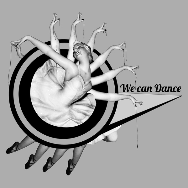
Sebastian Ospina - Mixed Media

This is a series of collages by Columbian Graphic Designer Sebastian Ospina. 
I found these a great inspiration and had a "I wish I had done these" moment when I saw them. 
The neutral tones of the background bring out the images and give a much more vivid feel to any colours that have been put on top. 
I also admire the amount of detail put in. Collage can get over-complicated very easily, and I do not see that exhibited in any of these.
The combination of hand-drawn assets, photographs and abstract shapes is perfect in my eyes. I would add type in with it, as is shown in a couple of these. 
I am going to try and use techniques that I have been inspired by in these pieces for a number of my briefs, namely the gig posters and the supremebeing ones. 


Tuesday, 25 October 2011

Collaboration - Crosses

So for my collaboration with Steven Elmes and Jonathan Fee (Digital Games and Animation) I have been asked to design firstly some picket signs for a protest that they are staging in the film '2012' that they are producing. 
They have asked specifically for religious slogans surrounding the apocalypse... for example "the end is nigh" and "christ cannot save you now". They have also asked me to create a contemporary crucifix, his words were "down with the kids rather than typically Protestant or Catholic".

I have looked into different imagery that I could use, my first thoughts were simple cross images, that seem to crop up a lot recently in fashion. It seems that Religion is becoming fashionable...


I have also started to look into the "hipster" trend of the triangle symbol. It appears to be "cool" to have triangle motifs on everything you own these days. 

A few examples... 


It seems that a combination of the two will be an appropriate resolution for this part of the brief. I will try out a range of different combinations and pitch all of them to Steve and Jon and see which they prefer at the end. 

Wednesday, 19 October 2011

Alpine Soundtrack - T-shirt design ideas

These are a couple of ideas for how to position my headphones design on a t-shirt. I could have the headphones hanging around the neck with the alpine designs running down the t-shirt. This is definitely an idea that I will try out, it may not work, but if it works out the way that I think it will, it will work well. 


Thriller headphones


This is a clever idea. If I were to take my Alpine Soundtrack brief into 3D this would be something that I would be interested in working like. I could re-create this in an alpine theme. Just a fun little idea I thought.

Headphones design


These are a couple of designs which are using the same idea. I was looking for images of headphones leaking out other images to go with my idea for the Alpine Soundtrack T-shirt. 
These have worked, especially the second one, as it does look like the green paint is being sprayed out of  the headphones, which is the effect that I want to get, but with a lot more detail in the images, rather than just sprays.