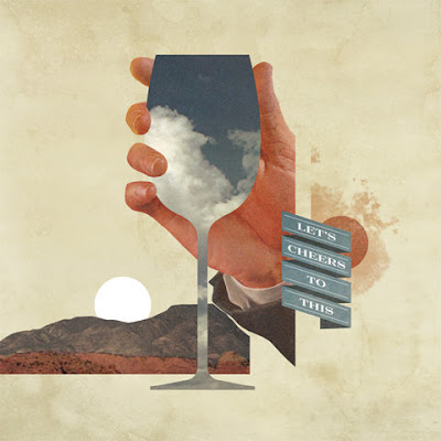
This is an interesting use of collage. Very simple and very 'to the point', a clear juxtaposition of images drawn from photographs and textures.
The type in the banner is a standard serif font which does not take away any focus on the image.
The neutral colour palette adds to the subtlety of the image, making it look natural and warm. My first thought when I saw this was bland, desert heat.

No comments:
Post a Comment