Now Brothers Cider is a very specific brand... with a very clever advertising/branding campaign.
The target audience is clear - young people, wanting to have fun.
This is clear from the imagery, the type and the images used.

Mixing the original pear cider recipe with other flavours... playing with the young people's love of alcopops. The sans serif font adds a contemporary edge, making the drink very informal. It stands out clearly behind a bar... one glance at a bottle, even if it is a newly introduced flavour... is instantly recognisable as being from Brothers.
They also pride themselves on being a festival drink... originally having the 'Festival Strength' just for the actual festivals... but then introducing it to retailers.
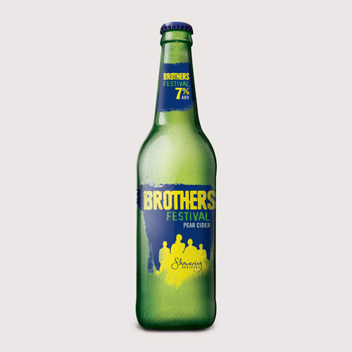
Brothers originated from Glastonbury Festival... very close to the brewery itself. It is very much a family-run business, and when they introduced bottles of festival strength... they made the design a lot more personal. Adding the family name 'Showering' to the bottles... and a choice of each of the brothers names on the back.

They then introduced a load of products to spread the word. Each with a fun-feel to it, putting their name on different campaigns around the local areas.
.JPG)
Advertising campaigns -


Advertising campaigns -
There was a while where these billboards were everywhere... Bright colours and bold, crisp type makes the message very clear.

No comments:
Post a Comment